コーディングをしていると、コンテンツは特定の幅(インナー幅)に収まることが多いです。
ですが最近インナー幅からはみ出ているレイアウトのデザインが多くなったと感じます。
毎回どうやってコーディングするか悩んでしまっているので、頻出レイアウトのコーディングについてまとめてみました。
デモも用意しましたので、興味がある方は覗いてみてください。
また前提となるインナー幅についても解説しているので、コーディング初心者の方はぜひ読んでみてください。
インナー幅について
デザインカンプには大抵水色の線(ガイド線)が引かれています。
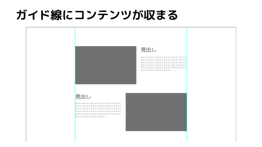
これがコンテンツの最大幅で、それより大きい画面幅のときに画面の左右中央に配置されるようにコーディングしていきます。
この幅をインナー幅と呼んでいます。
インナー幅を意識せずコーディングすると、コンテンツ幅もそのまま広がってしまいます。
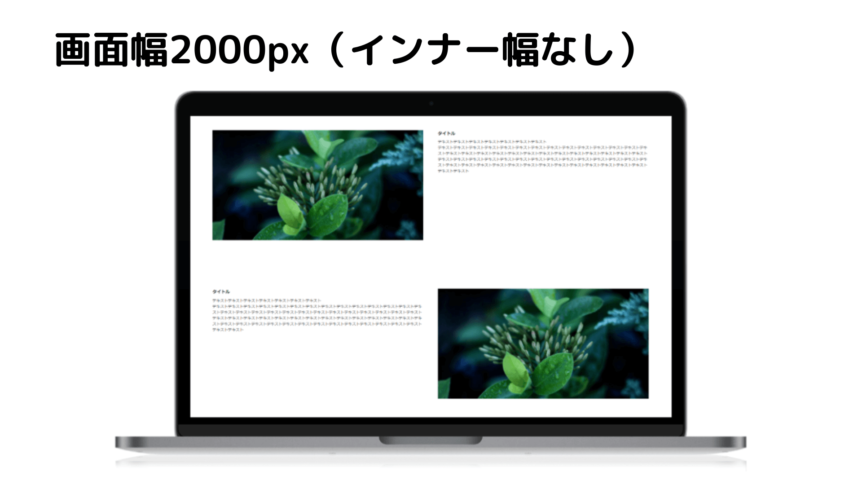
そうならないために、インナー幅でコンテンツを囲みましょう。
代表的なレイアウトに、リキッドレイアウトとソリッドレイアウトがあります。
簡単に違いを言いますと、画面幅を縮めたときに横スクロールバーが出るのがソリッドレイアウトで、出ないのがリキッドレイアウトです。
もっと詳しく知りたいという方は、以下の記事をご覧ください。
リキッドレイアウトは誰でもできる!!コーディングのコツまとめました
以前はソリッドレイアウトが主でしたが、リキッドレイアウトでのコーディングも増えてきた印象です。
ソリッドレイアウトかリキッドレイアウトかによってインナー幅の指定が若干異なりますので、それぞれ紹介します。
HTMLは共通で、以下のコードになります。
1 2 3 4 5 6 7 8 9 10 11 | <body> <div id="wrapper"> <main class="outer-block"> <div class="inner-block"> コンテンツ </div> </main> </div><!-- /wrapper --> </body> |
今回はインナー幅が1000pxになるように、それぞれスタイルを記述します。
1 2 3 4 5 6 7 8 9 10 11 12 13 14 15 16 17 18 19 20 21 22 23 24 25 26 27 28 29 30 31 32 33 34 35 36 37 38 39 | *, *::before, *::after { box-sizing: border-box; } .outer-block { min-width: 1080px; } .inner-block { width: 1060px; padding: 0 30px; } /* PC */ @media only screen and (min-width: 641px) { .inner-block { margin: 0 auto; } } /* SP */ @media only screen and (max-width: 640px) { #wrapper { min-width: 320px; } .outer-block { min-width: 320px; } .inner-block { width: auto; padding: 0 10px; } } |
1 2 3 4 5 6 7 8 9 10 11 12 13 14 15 16 17 18 19 20 | *, *::before, *::after { box-sizing: border-box; } .inner-block { max-width: 1060px; margin: 0 auto; padding: 0 30px; } /* SP */ @media only screen and (max-width: 640px) { .inner-block { padding: 0 10px; } } |
ポイントは以下の3点です。
インナー幅を指定する
左右のpaddingを指定する
margin: 0 auto;で中央寄せ
レイアウトによる大きな違いはインナー幅の指定方法です。
リキッドレイアウト:max-widthで指定する
指定する値は、インナー幅の左右のpaddingを足した値を指定します。(全ての要素にbox-sizing: border-box;が指定されている想定です)
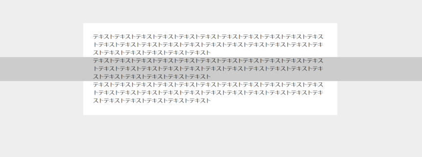
そもそもなぜ左右のpaddingを指定するのかというと、インナー幅以下の画面幅になるとコンテンツが画面幅ピッタリにくっついて見えづらくなるのを避けるためです。
左右の余白がなく、見えづらい
そして幅を指定して、margin: 0 auto;で中央寄せできるのは鉄板ですね。
知らなかったという方はこちらの記事を参照してみてください。
これでインナー幅の指定方法については以上になります。
もっと詳しく知りたいという方は、こちらの記事を参照ください。
CSS 最近のWebページやアプリのレイアウトに適した、ラッパーの実装テクニックを徹底解説
レイアウト
インナー幅を押さえたところで、そこから飛び出たレイアウトのコーディングを紹介していきます。
今回はリセットCSSとして、ress.cssを読み込みました。
その他、共通のHTML構造とスタイルは以下になります。
1 2 3 4 5 6 7 8 9 | <body> <div id="wrapper"> <main> <!-- コンテンツがはいります --> </main> </div><!-- /wrapper --> </body> |
1 2 3 4 5 6 7 8 9 10 11 12 13 14 15 16 17 18 19 20 21 22 23 24 25 26 27 28 29 30 31 32 33 34 35 36 37 38 39 40 41 42 43 44 45 46 47 48 49 50 51 52 | #wrapper { position: relative; overflow: hidden; } .inner-block { position: relative; max-width: 1060px; padding: 0 30px; } img { border: 0; margin: 0; vertical-align: top; max-width: 100%; } section { background-color: #eee; overflow: hidden; padding-top: 100px; padding-bottom: 100px; } section h1 { font-size: 32px; font-weight: bold; margin-bottom: 2em; text-align: center; } .title { font-size: 24px; letter-spacing: 0.025em; font-weight: bold; line-height: 1.1; } @media only screen and (min-width: 641px) { .inner-block { margin: 0 auto; } } @media only screen and (max-width: 640px) { .inner-block { padding: 0 10px; } } |
子要素がインナー幅からはみ出したレイアウト
1 2 3 4 5 6 7 8 9 10 | <section class="section01"> <h1>①子要素がインナー幅からはみ出したレイアウト</h1> <div class="inner-block"> <p class="text">テキストテキストテキストテキストテキストテキストテキストテキストテキストテキストテキストテキストテキストテキストテキストテキストテキストテキストテキストテキストテキストテキストテキストテキストテキストテキストテキスト</p> <p class="full text">テキストテキストテキストテキストテキストテキストテキストテキストテキストテキストテキストテキストテキストテキストテキストテキストテキストテキストテキストテキストテキストテキストテキストテキストテキストテキストテキスト</p> <p class="text">テキストテキストテキストテキストテキストテキストテキストテキストテキストテキストテキストテキストテキストテキストテキストテキストテキストテキストテキストテキストテキストテキストテキストテキストテキストテキストテキスト</p> </div> </section> |
1 2 3 4 5 6 7 8 9 10 11 12 13 | .section01 .inner-block { padding-top: 30px; padding-bottom: 30px; background-color: #fff; } .section01 .full { margin: 0 calc(50% - 50vw); padding: 0 calc(50vw - 50%); background-color: #ccc; } |
子要素が画面幅いっぱいに広がって、かつコンテンツはインナー幅に収まるというレイアウトです。
重要なのは2つの指定ですね。
1 2 3 4 5 6 | .section01 .full { margin: 0 calc(50% - 50vw); padding: 0 calc(50vw - 50%); } |
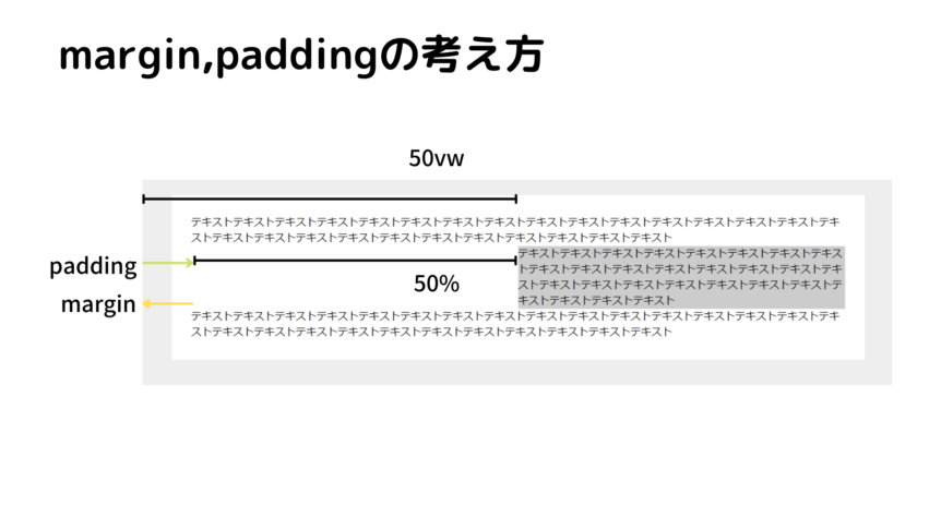
paddingもmarginも同じ幅(50vw – 50%)を求めているのですが、marginはネガティブマージンでインナー幅からはみ出させます。
なので以下のように書き直します。
このように左右のmarginとpaddingを指定すると、インナー幅からはみ出したレイアウトを実現できます。
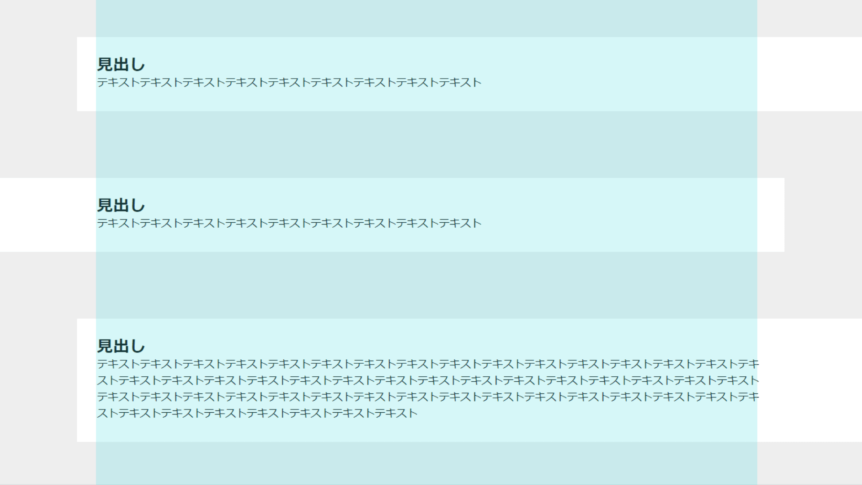
片側がはみ出したレイアウト
1 2 3 4 5 6 7 8 9 10 11 12 13 14 15 16 17 18 19 | <section class="section02"> <h1>②片側がはみ出したレイアウト(擬似要素)</h1> <div class="inner-block"> <div class="box"> <h2 class="title">見出し</h2> <p class="text">テキストテキストテキストテキストテキストテキストテキストテキストテキスト</p> </div> <div class="box"> <h2 class="title">見出し</h2> <p class="text">テキストテキストテキストテキストテキストテキストテキストテキストテキスト</p> </div> <div class="box"> <h2 class="title">見出し</h2> <p class="text">テキストテキストテキストテキストテキストテキストテキストテキストテキストテキストテキストテキストテキストテキストテキストテキストテキストテキストテキストテキストテキストテキストテキストテキストテキストテキストテキストテキストテキストテキストテキストテキストテキストテキストテキストテキストテキストテキストテキストテキストテキストテキストテキストテキストテキストテキストテキストテキストテキストテキストテキストテキストテキストテキスト</p> </div> </div> </section> |
1 2 3 4 5 6 7 8 9 10 11 12 13 14 15 16 17 18 19 20 21 22 23 24 25 26 27 28 29 30 31 32 33 34 35 36 37 38 39 40 41 42 43 44 45 46 | .section02 .box { z-index: 0; position: relative; padding-top: 30px; padding-bottom: 30px; } .section02 .box::before { content: ""; display: block; width: 100vw; height: 100%; background-color: #fff; position: absolute; z-index: -1; top: 0; } .section02 .box + .box { margin-top: 100px; } .section02 .box:nth-child(odd)::before { left: -30px; } .section02 .box:nth-child(even)::before { right: -30px; } @media only screen and (max-width: 640px) { .section02 .box { padding-top: 15px; padding-bottom: 15px; } .section02 .box:nth-child(odd)::before { left: -15px; } .section02 .box:nth-child(even)::before { right: -15px; } } |
このように今まで擬似要素でコーディングしていたのですが、先ほど紹介した子要素がインナー幅からはみ出したレイアウトでの手法を用いると、次のように実装できます。
1 2 3 4 5 6 7 8 9 10 11 12 13 14 15 16 17 18 19 20 21 22 23 24 25 26 27 28 29 30 31 32 33 34 35 36 37 38 39 40 | .section02 .box { padding-top: 30px; padding-bottom: 30px; background-color: #fff; } .section02 .box + .box { margin-top: 100px; } .section02 .box:nth-child(odd) { margin-right: calc(50% - 50vw); margin-left: -30px; padding-right: calc(50vw - 50%); padding-left: 30px; } .section02 .box:nth-child(even) { margin-right: -30px; margin-left: calc(50% - 50vw); padding-right: 30px; padding-left: calc(50vw - 50%); } @media only screen and (max-width: 640px) { .section02 .box { padding-top: 15px; padding-bottom: 15px; } .section02 .box:nth-child(odd) { margin-left: calc(50% - 50vw); padding-left: calc(50vw - 50%); } .section02 .box:nth-child(even) { margin-right: calc(50% - 50vw); padding-right: calc(50vw - 50%); } } |
2つ紹介しましたが、後者の実装がよさそうです。
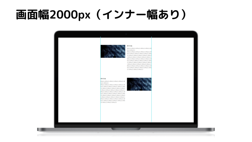
画像とテキストが交互にあり、画像がはみ出すレイアウト
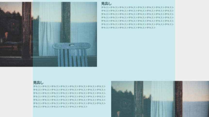
こちら最近よく見るなと思っています。
デザインカンプの幅以外ではどういう見え方が正解なのだろうと、個人的に悩むデザインです。
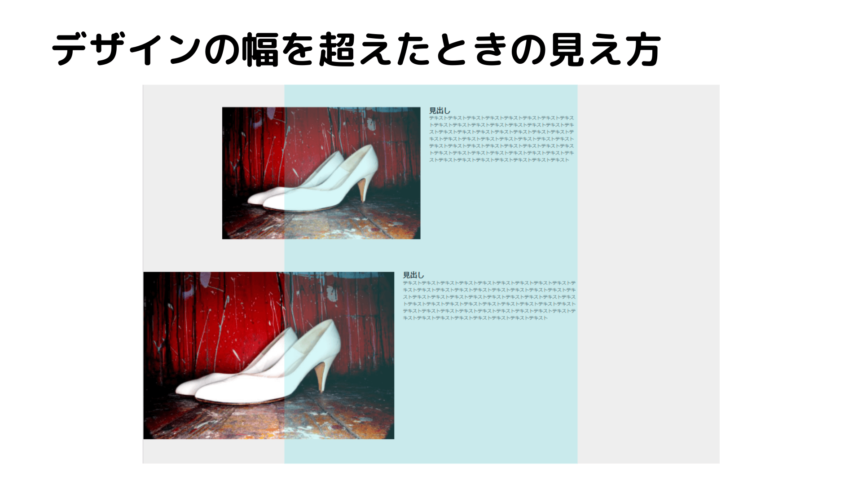
デザインカンプの幅を超えたとき、どういう見え方を想定しているのか?
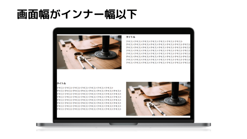
すでにコーディングされているものがある場合は、それに合わせます。
ない場合はデザイナーの方にどんなイメージなのか聞いたほうがいいかもしれません。
1 2 3 4 5 6 7 8 9 10 11 12 13 14 15 16 17 18 19 20 21 22 23 24 25 26 27 28 29 30 31 32 33 | <section class="section03"> <div class="inner-block"> <div class="box"> <div class="img"> <img src="https://picsum.photos/960/500"> </div> <div class="txt-area"> <h3 class="title">見出し</h3> <p class="text">テキストテキストテキストテキストテキストテキストテキストテキストテキストテキストテキストテキストテキストテキストテキストテキストテキストテキストテキストテキストテキストテキストテキストテキストテキストテキストテキストテキストテキストテキストテキストテキストテキストテキストテキストテキストテキストテキストテキストテキストテキストテキストテキストテキストテキストテキストテキストテキストテキストテキストテキストテキストテキストテキスト</p> </div> </div> <div class="box"> <div class="img"> <img src="https://picsum.photos/960/500"> </div> <div class="txt-area"> <h3 class="title">見出し</h3> <p class="text">テキストテキストテキストテキストテキストテキストテキストテキストテキストテキストテキストテキストテキストテキストテキストテキストテキストテキストテキストテキストテキストテキストテキストテキストテキストテキストテキストテキストテキストテキストテキストテキストテキストテキストテキストテキストテキストテキストテキストテキストテキストテキストテキストテキストテキストテキストテキストテキストテキストテキストテキストテキストテキストテキスト</p> </div> </div> <div class="box"> <div class="img"> <img src="https://picsum.photos/960/500"> </div> <div class="txt-area"> <h3 class="title">見出し</h3> <p class="text">テキストテキストテキストテキストテキストテキストテキストテキストテキストテキストテキストテキストテキストテキストテキストテキストテキストテキストテキストテキストテキストテキストテキストテキストテキストテキストテキストテキストテキストテキストテキストテキストテキストテキストテキストテキストテキストテキストテキストテキストテキストテキストテキストテキストテキストテキストテキストテキストテキストテキストテキストテキストテキストテキスト</p> </div> </div> </div> </section> |
1 2 3 4 5 6 7 8 9 10 11 12 13 14 15 16 17 18 19 20 21 22 23 24 25 26 27 28 29 30 31 32 33 34 35 36 37 38 39 40 41 42 43 44 45 46 47 48 49 50 51 52 53 54 55 56 57 58 59 60 61 62 63 64 | .section03 .inner-block { z-index: 0; } .section03 .box { position: relative; } .section03 .box + .box { margin-top: 475px; } .section03 .img img { object-fit: cover; width: 100%; } @media only screen and (min-width: 641px) { .section03 { padding-bottom: 360px; } .section03 .box:nth-child(even) .img { right: -490px; } .section03 .box:nth-child(even) .txt-area { margin-right: auto; } .section03 .box:nth-child(odd) .img { left: -490px; } .section03 .box:nth-child(odd) .txt-area { margin-left: auto; } .section03 .img { width: 860px; position: absolute; z-index: -1; } .section03 .txt-area { width: calc(100% - 400px); } } @media only screen and (max-width: 640px) { .section03 .box + .box { margin-top: 100px; } .section03 .img { margin: 0 calc(50% - 50vw); } .section03 .txt-area { margin-top: 20px; } } |
1 2 3 4 5 6 7 8 9 10 11 12 13 14 15 16 17 18 19 20 21 22 23 24 25 26 27 28 29 30 31 32 33 34 35 36 37 38 39 40 41 42 43 44 45 46 47 48 49 50 51 52 53 54 55 56 57 58 | .section03 .box { display: -webkit-box; display: -webkit-flex; display: -ms-flexbox; display: flex; } .section03 .box + .box { margin-top: 100px; } .section03 .img img { width: 100%; object-fit: cover; } @media only screen and (min-width: 641px) { .section03 .box:nth-child(even) { margin-right: calc(50% - 50vw); flex-direction: row-reverse; } .section03 .box:nth-child(even) .txt-area { margin-right: 30px; } .section03 .box:nth-child(odd) { margin-left: calc(50% - 50vw); } .section03 .box:nth-child(odd) .txt-area { margin-left: 30px; } .section03 .img { flex: 2 1 680px; } .section03 .txt-area { flex: 1 1 510px; } } @media only screen and (max-width: 640px) { .section03 .box { flex-direction: column; } .section03 .img { margin: 0 calc(50% - 50vw); } .section03 .txt-area { margin-top: 20px; } } |
absoluteが先ほどの画像の上の見え方で、flexが下の見え方になります。
個人的にはabsoluteでの実装だと、画像が浮いて高さを確保できないので好きではないです。
テキストの量と画像の高さに応じてmarginの調整し、さらにテキストが動的だとJavaScriptで制御する必要があります。
ソリッドレイアウトなら調整が少ないので、absoluteで指定するのもありかなと思いました。
まとめ
インナー幅に収まらない、少しずらしたレイアウトが近年増えてきている印象です。
効果的に使えばユーザーの目を引き、コンテンツに注目を集めることができます。
padding: 0 calc(50vw – 50%);
とりあえず、インナー幅から画面幅いっぱいに広げたいときはmarginの指定、コンテンツはインナー幅に押さえたいときはさらにpaddingも指定するとうまくいきそうです。
今回挙げた実装方法が正解というわけではないですが、参考になる部分があれば幸いです。
またもっといい方法を知っているという方は、教えていただけると助かります!

を使った実践的なコーディングサンプル3選!")
【2022年版】")
")
